

Please note: you can find a recent detailed subject related UKC article here.
These two graphs were shown on the 1st Feb 2021 UKC report. They are both based on official UK stats (please see the url printed on each graph for the data source).
This first graph shows three things (click graph to enlarge):
- Number of deaths for each day of individuals over 80 years, in the UK is shown by the tan colored line.
- The vertical line in the centre shows the beginning of CV19 vaccination on 9th Dec 2020 (with the elderly in care homes being the first target group).
- The pink line is a 7 day moving average of the daily deaths - just to show the weekly trend more clearly.
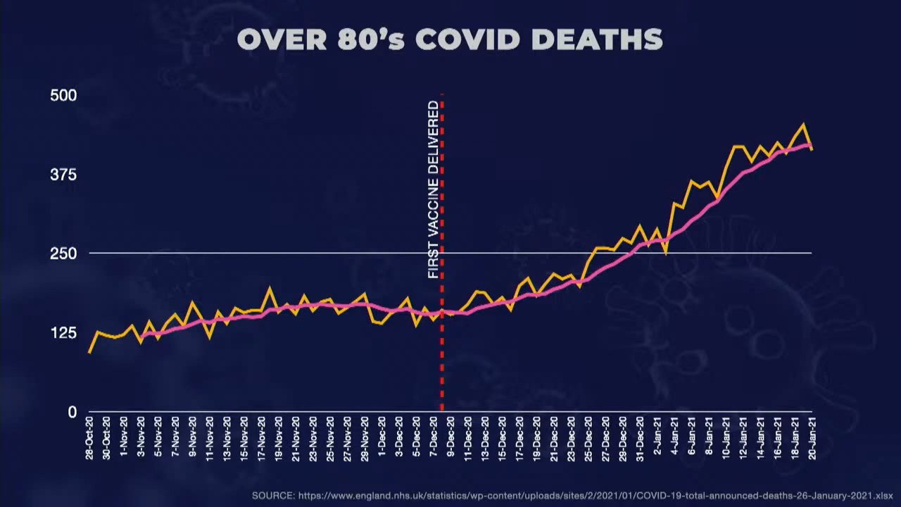
Of course the disclaimer applies that correlation does not equal causation (i.e. there could be several reasons for the rise in over 80s deaths after the beginning of the CV19 vaccination drive, most obviously, the specific time of year), but nevertheless, this graph is concerning imo.
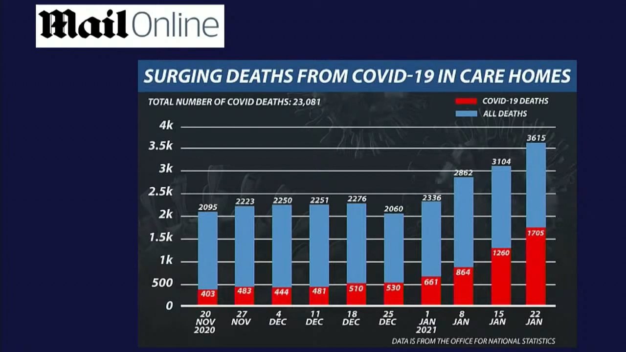
This second graph doesn't have the same 9th Dec 2020 roll-out of vax marked on it, but nevertheless shows how care home CV19 related deaths have risen approx fourfold since the 9th Dec, whereas other causes of deaths have remained at a similar level. Of course it would be expected there would typically be increased deaths from seasonal flu over the winter too...
The same UKC report featured an audio recording with an anonymous care worker who (anecdotally) expressed that in their opinion, in the days after their CV19 vax, residents he was caring for suffered from a suppressed immune system.
As linked above, you can also find a recent detailed subject related UKC article here.