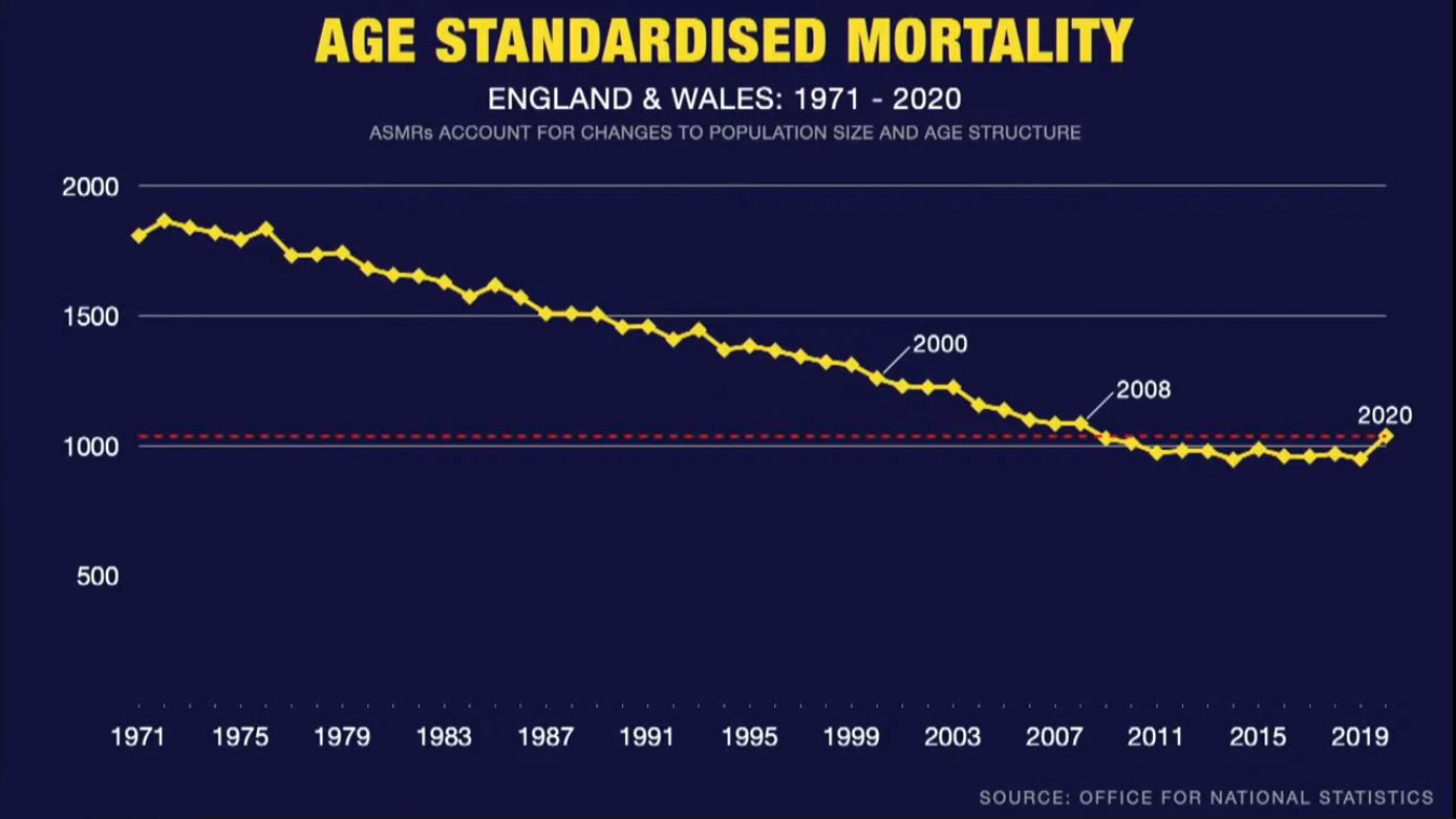

UKC showed the graph below on their 18th Jan 2021 report (starting at 23:50 mins). The graph shows age standardized mortality for the English and Welsh population between 1971 and 2020 inclusive, based on data published by the UK Office for National Statistics. [I'm presuming the Y scale is mortality rate per 100k.] The UKC report also states that the data is adjusted for UK population level and age structure, given these have changed dramatically since 1979.
As can be seen, 2020 shows a slight uptick in mortality, but nothing dramatic and/or which can't be explained by the excess mortality caused by both a) the policy of sending of CV19 positive cases from hospitals into elderly people care homes (which subsequently caused the deaths of several tens of thousands of individuals in the homes), and b) the massive reduction in medical care services available to the general public via the national health service.
Further, the slight uptick showing in 2020 doesn't even match the mortality rate shown for 2008. Several other years have shown temporary upticks, plus several of the preceding years to 2020 has remained flat (i.e. mortality rates might have bottomed out anyway, so to speak).
According to this graph, there is seemingly not a level of mortality occurring in the UK which might indicate a serious pandemic. Rather this graph is in line with other indications which show the fatality rate in 2020 is in line with that expected from seasonal flu. Therefore, imo, there is good reason to hypothesize that what was previously a set of various symptoms ranging from the common cold to the seasonal flu, has now been redefined as CV19.
Clicking on the graph will open a larger version of it.